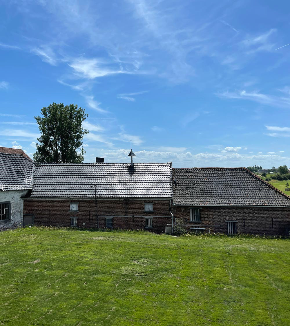
The Burnt Farm is a small, independent producer of high-quality whisky in Belgium. They use traditional distillation methods and only the finest ingredients to create a unique and authentic spirit, all without using any pesticide. Each bottle is a testament to the hard work and dedication of the team at Burnt Farm Distillery.
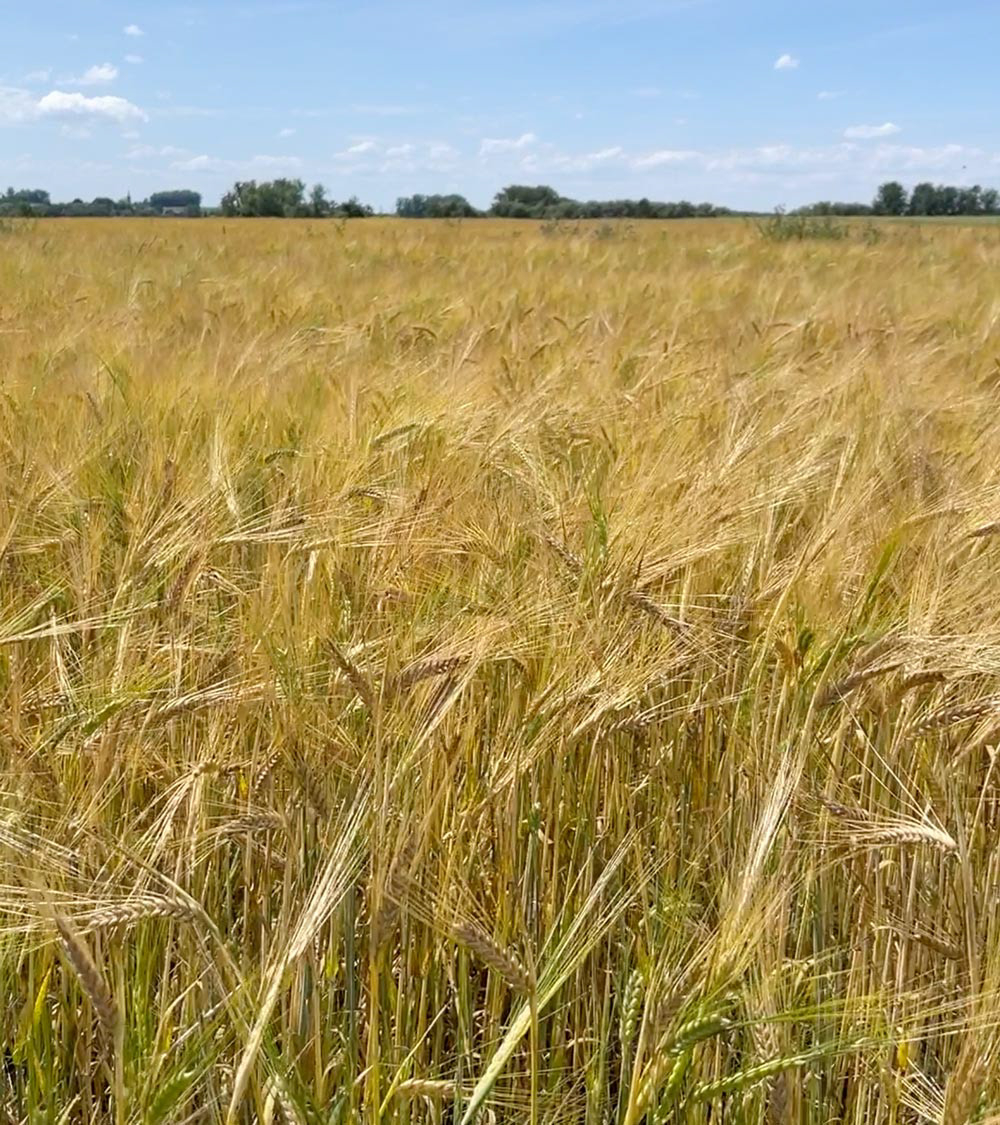
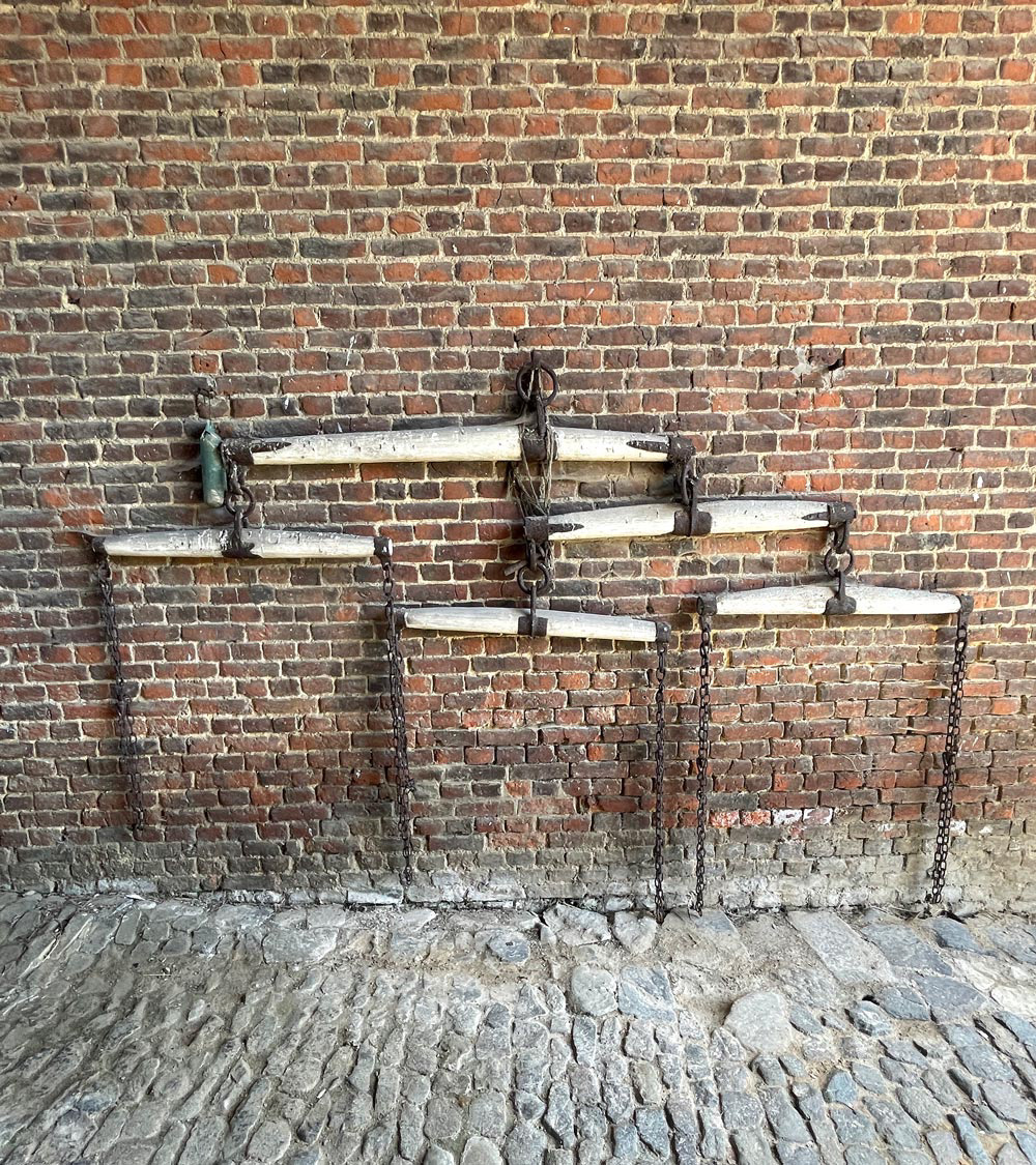
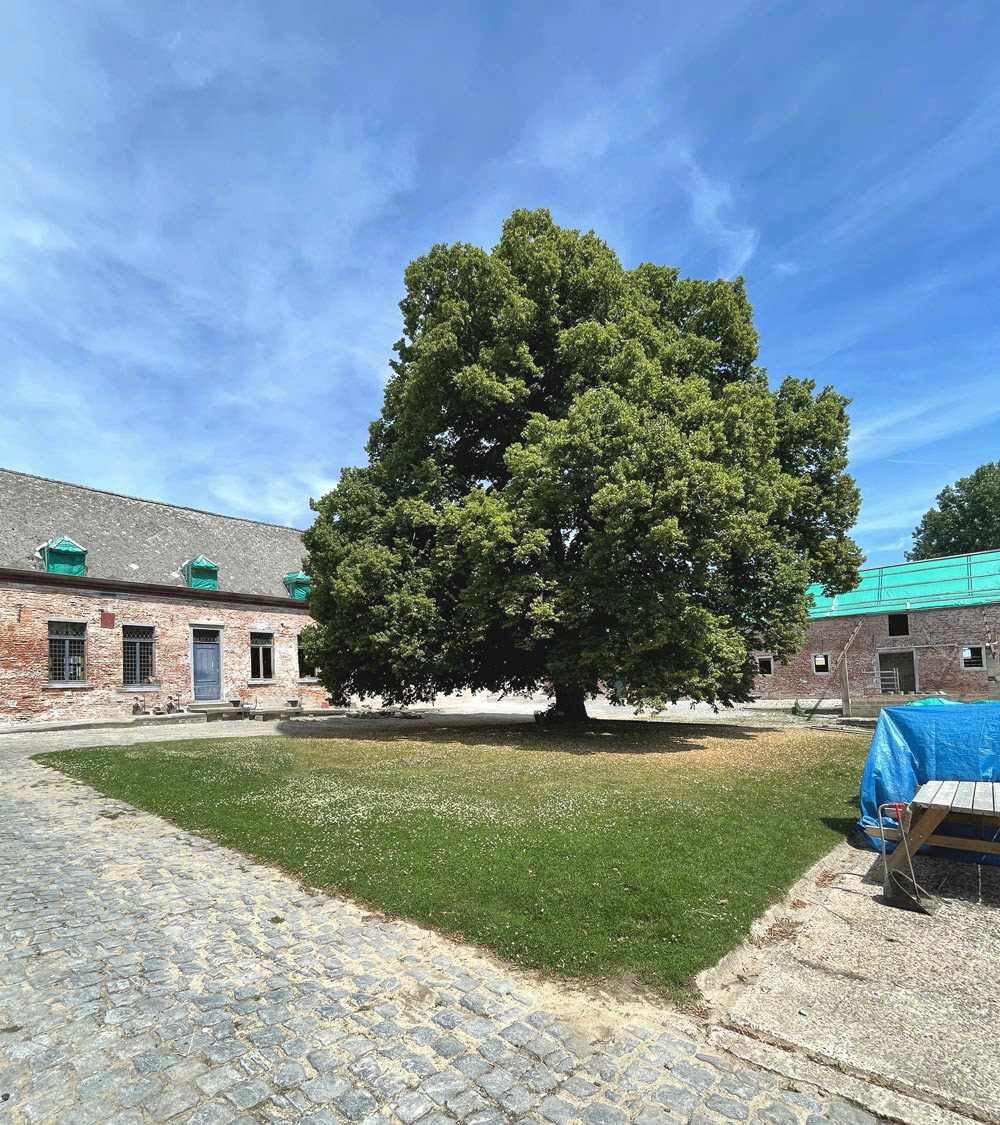
Our approach while designing this bottle and packaging was to create something which has the appearance as if it has always existed. An honest “farm-like” bottle which resembles the feeling of the Payottenland where The Burnt Farm is established.
In terms of shape, the bottle should be straightforward and functional, with clean lines and a sturdy base. Clear glass bottle, allowing the rich, amber color of the whisky to speak for itself. The label is minimal, featuring only essential information.
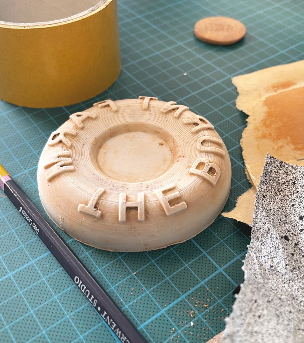
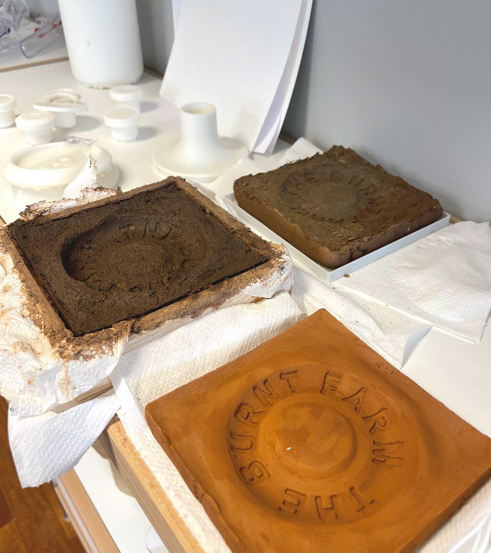
We looked at repurposing the unwanted grain byproducts, wood chips and other types of biomass into the packaging material, to really emphasise the environmental and authentic spirit of the brand.
This project was in close collaboration with Salmön+Salmön agency and RAAK Design Studio.
