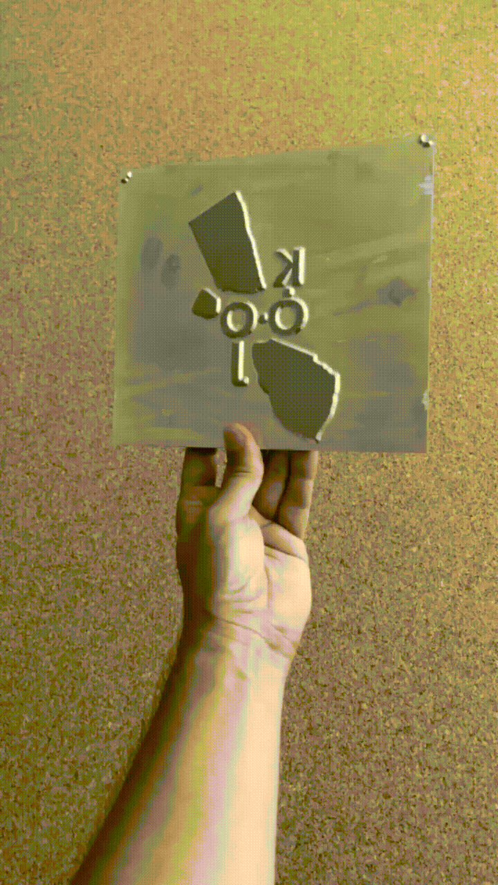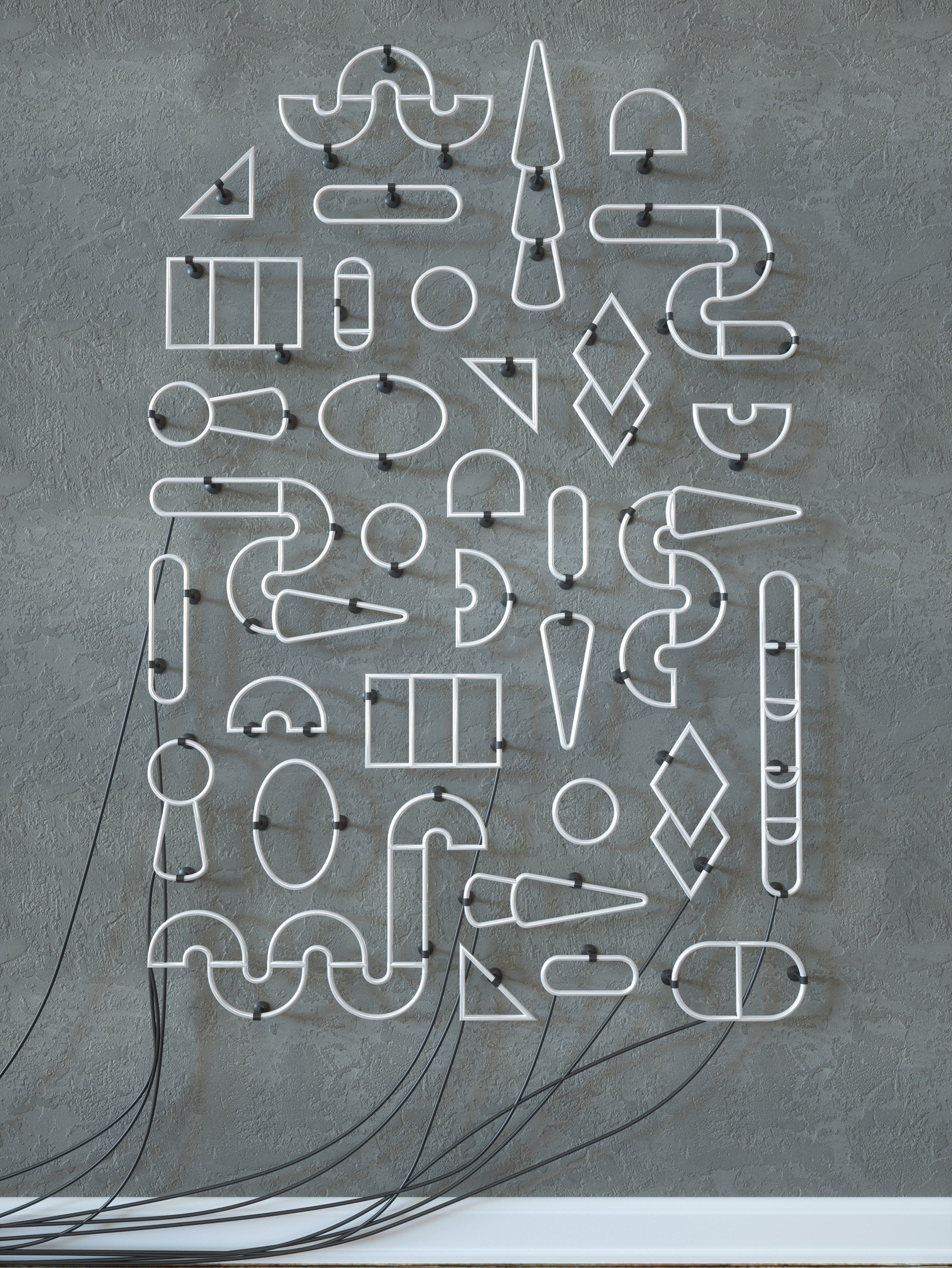
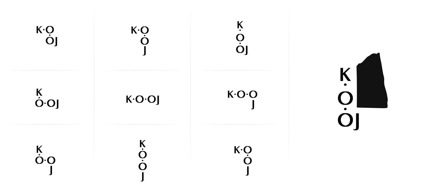
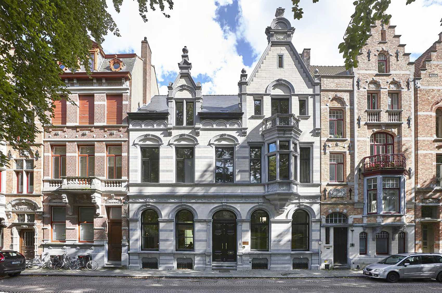
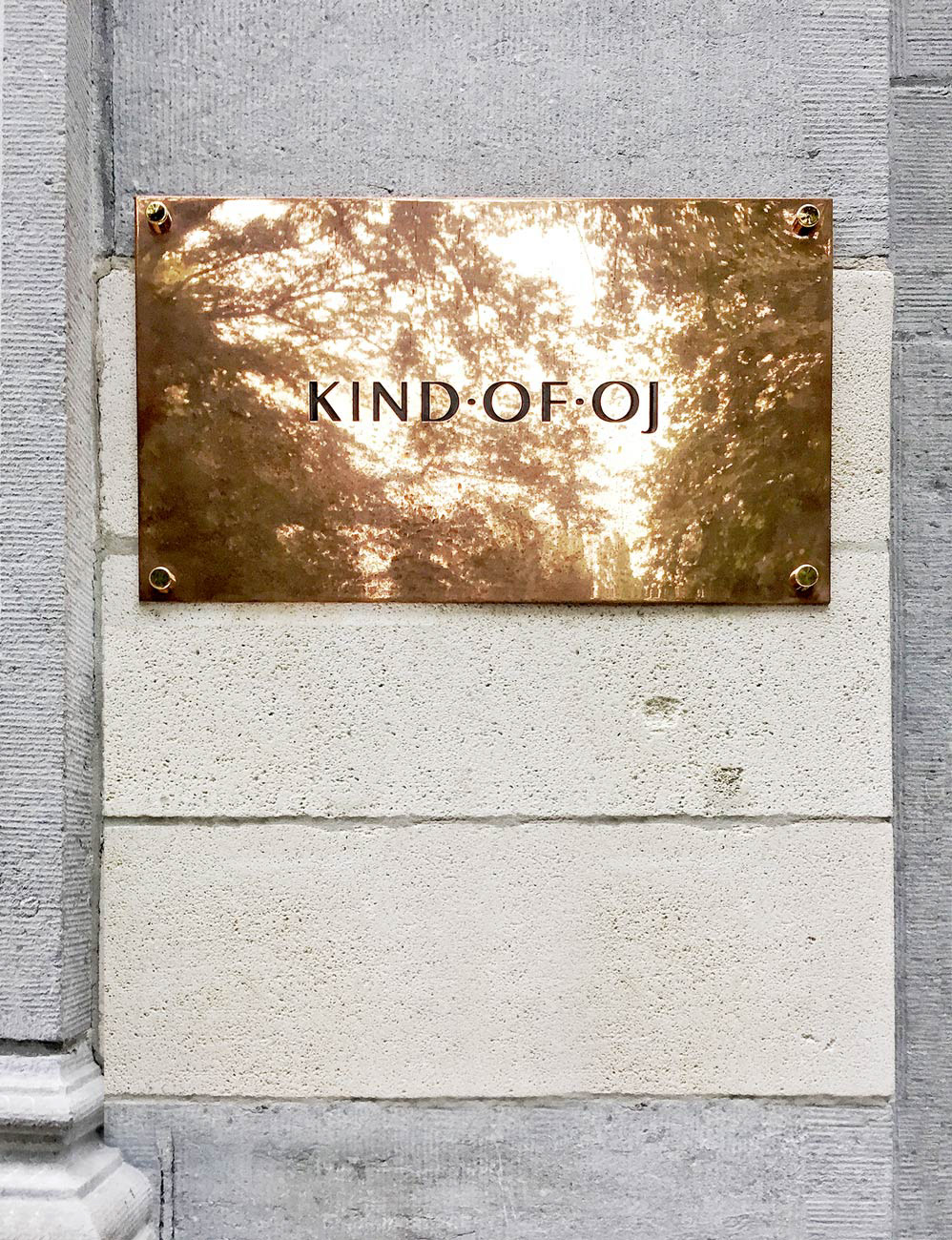
KIND•OF•OJ is the newest hotspot for art and design in Belgium. It's located in the historical centre of Bruges. K•O•OJ started as a design studio and recently opened up a small boutique hotel where you can experience their selected art & design. The owner and creator wanted a logo and graphic identity that reflected the core of the concept. It had to feel bespoke, adaptable and make a tactile impression. Just like the interior would change every season, the logo had to be able to also change frequently but remain recognisable.
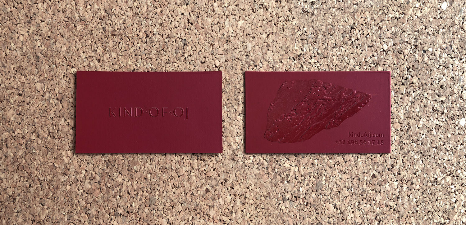
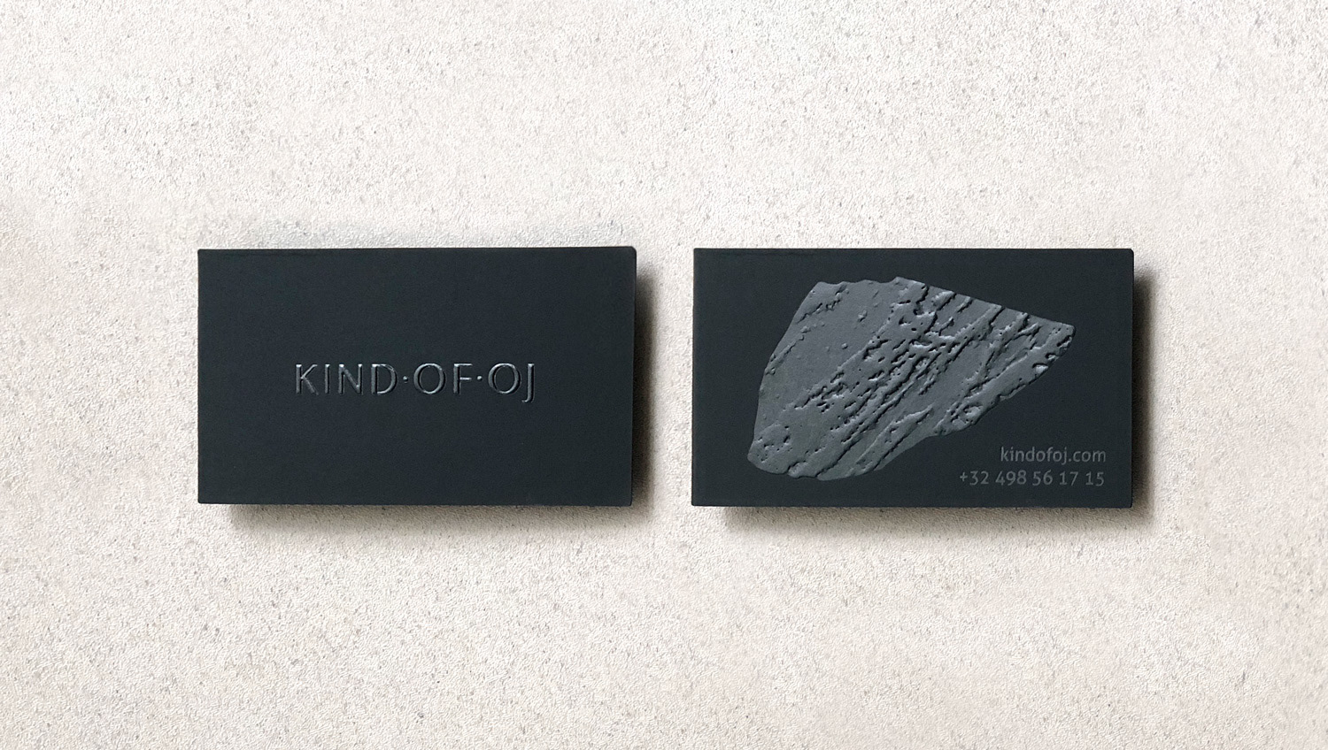
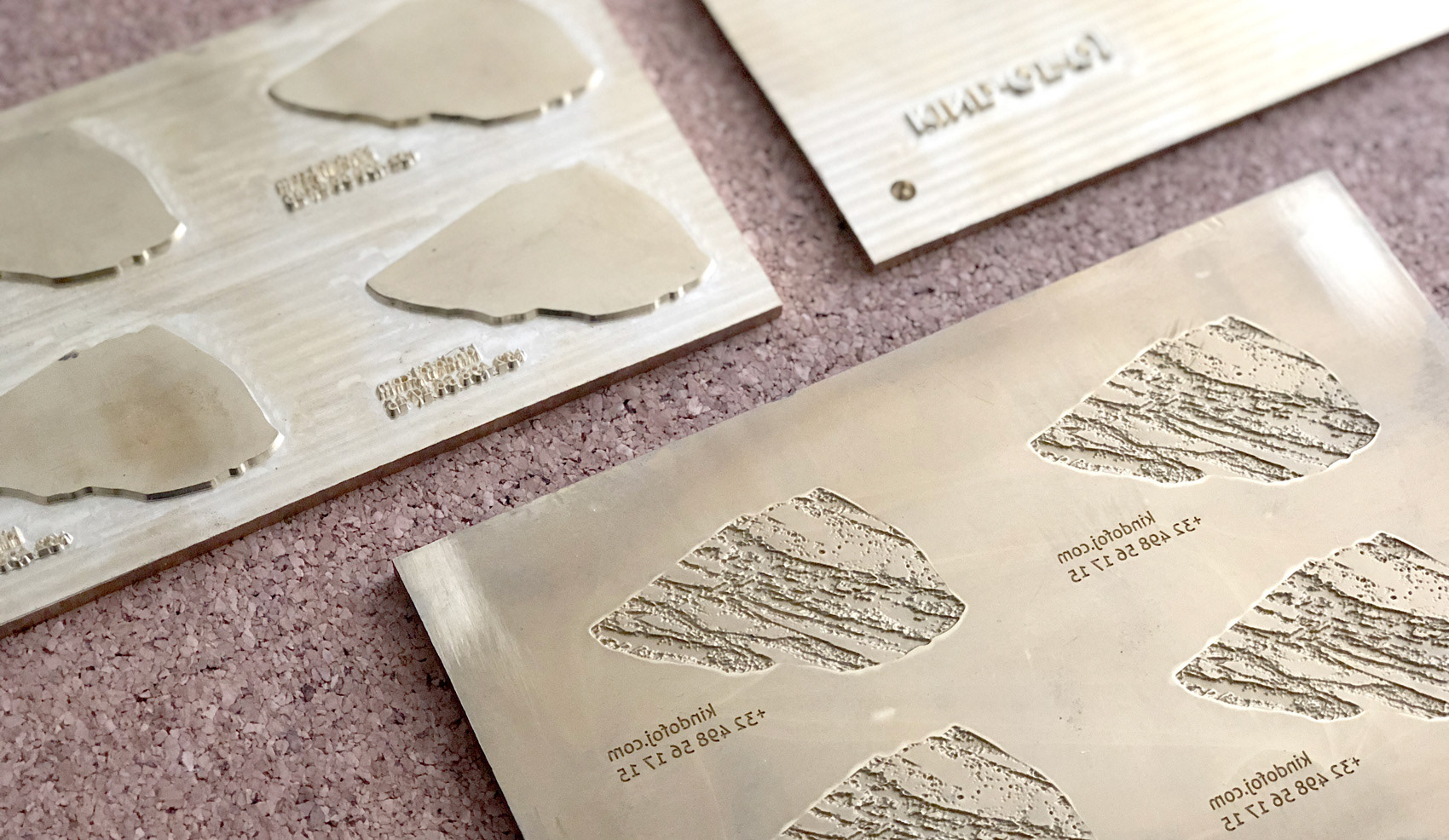
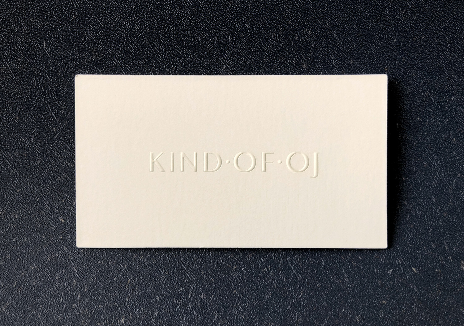
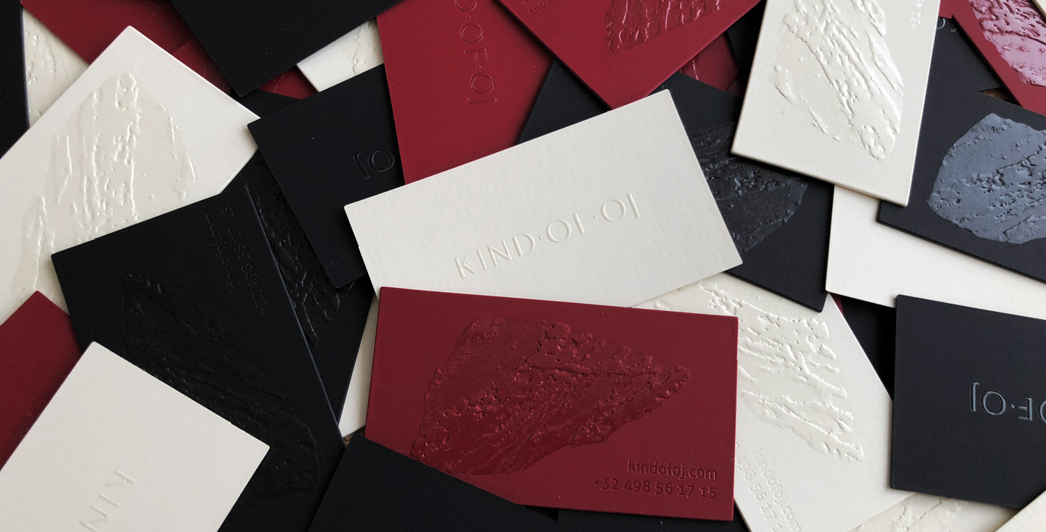
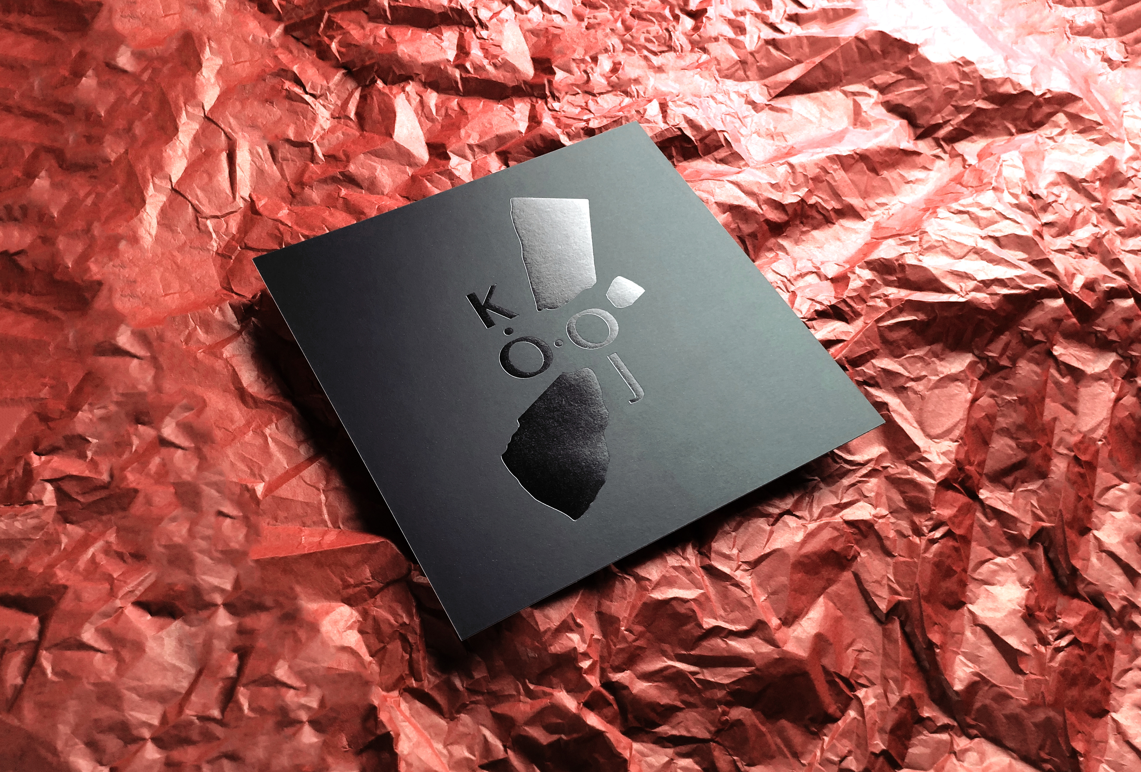
The colours and form of the logo were inspired by the burgundy speckled stone floor that runs throughout the ground floor. All the business cards consisted out of two separate sides that were embossed and covered in spot UV varnish. The paper we chose was Plike black, Plike bordeaux and Plike Ivory.
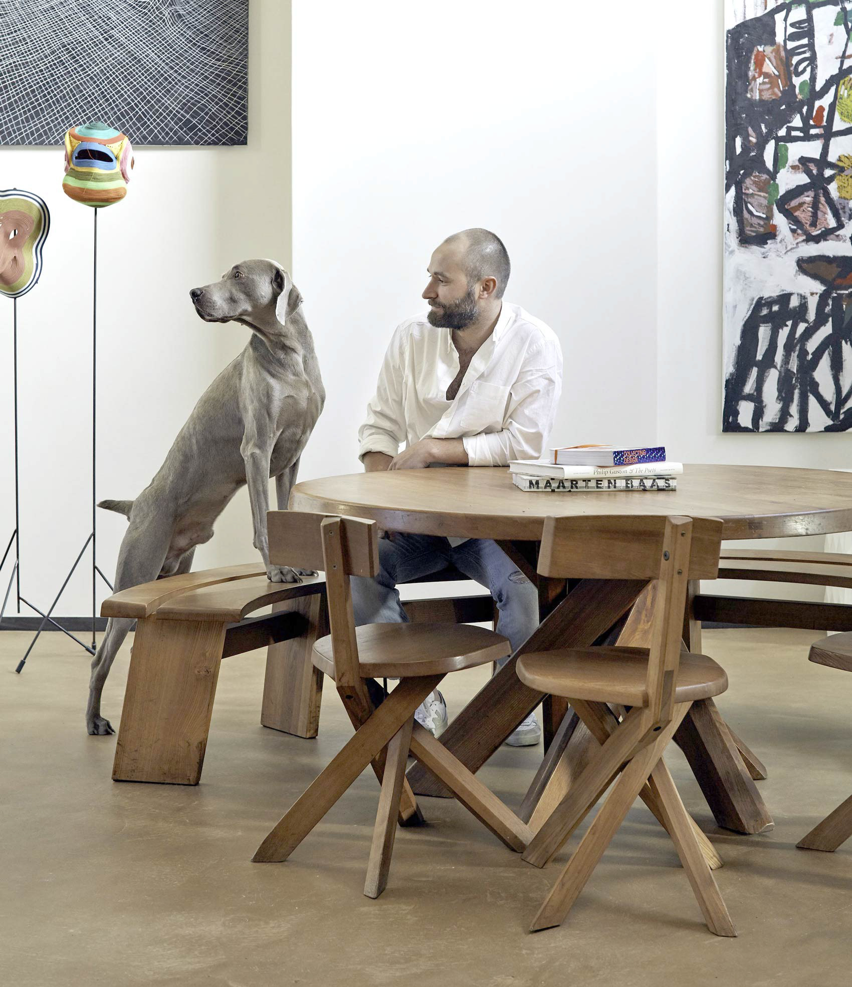
Meet the owner Jo Hoeven with his loyal friend Nelson © Depasquale + Maffini
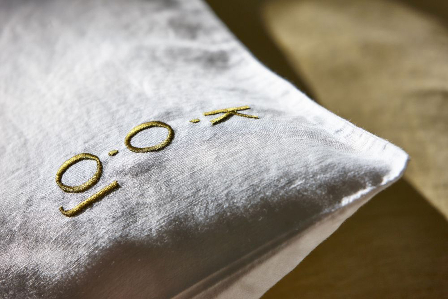
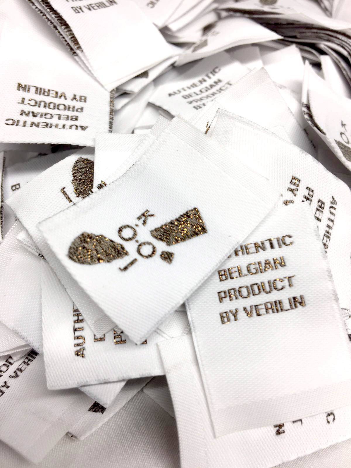
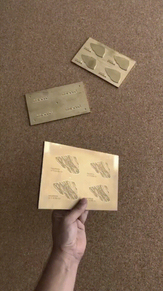
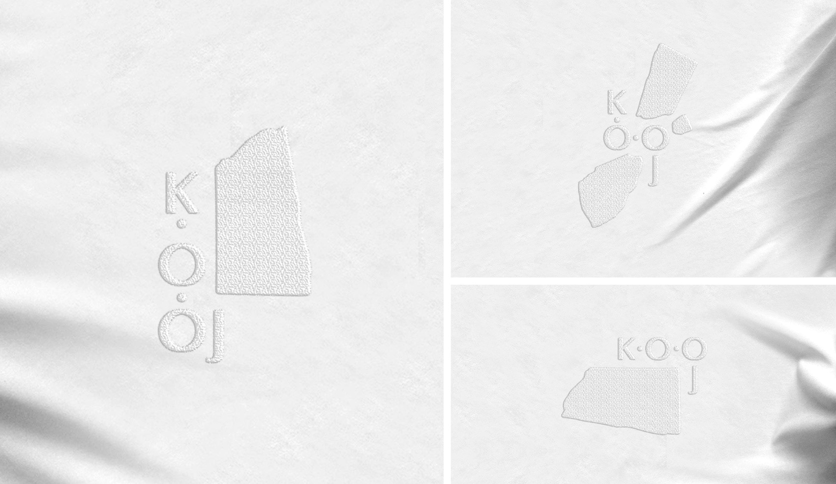
The logo was embroidered on all the linens. Above you see a cushion slope and below some exercise mockups.
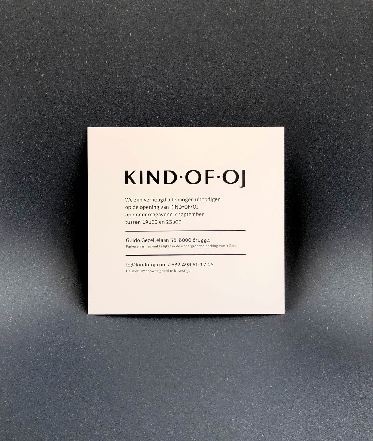
For the grand opening a minimalistic yet striking invitation was created using one of the secondary logos as a hero image.